
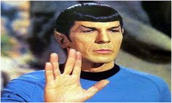
Half-Vulcan and half-human, Mr Spock is second in command of the USS Enterprise in Star Trek. Originally played by Leonard Nimoy, he is one of the central characters and has a very utilitarian approach to life and seems unable to experience normal human emotions based on his Vulcan heritage.
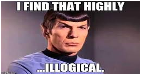
‘Highly illogical’ was one of his most famous lines and so he would most likely make a great web designer. His methodical, unemotional approach would mean that no website of his would contain ‘highly illogical’ features. For Somerset web designers, see http://www.somersetwebservices.co.uk .
Let’s take a look at some features of the worst websites around and their not so logical thinking. You wouldn’t get these past Spock!
Highly illogical features would include:
- Sites that are too dark – black backgrounds, flashing images and coloured text on black does not make for an pleasant experience and is more likely to give visitors a migraine.
- Animation – a little is OK but sites that are full of moving imagery just become too busy. Yes you want to attract attention but not at the expense of your product or service.
- Random music – a big turn off if it’s too annoying and is probably quite unnecessary.
- Tiny text – if your visitor needs to zoom then your writing is too small. Don’t make it too difficult to find information.
- Poor menu structure – there is nothing more annoying than getting lost and not finding access to what you need to know quickly.
- Poor colour co-ordination – red writing on a blue background or vice versa just looks horrid so don’t do it.
- Information everywhere – blocks of info in no sensible order will not win you many friends. Each separate piece of info should have it’s own page to make your message clear, concise and easy to access.
- Gifs – strange animated gifs that don’t fit the theme of the page or the services you offer.
- Lost opportunities – logos that do nothing when you click on them are both extremely frustrating and a missed business opportunity.
- Pulsating – random pulsating images that attract attention but are unclickable and pointless.
- Ads – sites that are crammed with fake ads, fake news, quizzes, surveys and online games will confuse visitors and only serve to detract from your business.
- Rainbow colours – there is no need to include every single colour on the spectrum and place it behind your text. Think of more inventive ways, if you need to include lots of colour, otherwise it looks messy and people won’t hang around for long. 48% of first impressions are based on colour and visual complexity so keep it clean and simple.
Spock would take one look at websites that have the above faults and question why any business would harm their chances to gain and retain custom. So let’s be logical about we want to see when we visit a site and put it to the Spock test.